Brand Identity
Salford Primary Arm
Salford City Council recognised the need for a distinct brand identity for their new educational board. Established to provide vital support to local primary schools. This initiative, named SPA as an abbreviation for Salford Primary Arm, sought to define its unique identity through collaboration with Hive.
Initially, Hive embarked on this branding journey by crafting a range of logo and website design options. These diverse designs played a crucial role in shaping the board’s brand identity. Ensuring that it resonated with its intended audience.
After careful consideration of the logo options, a definitive choice was made. This marked the beginning of the transition from concept to reality.
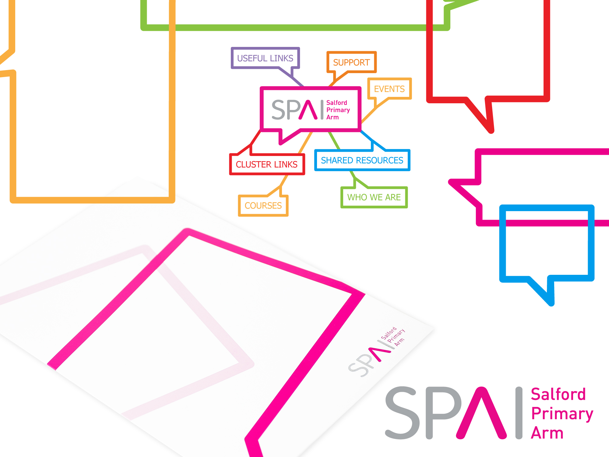
The end result was a brand that perfectly encapsulated the educational board’s core mission. The use of an ‘arrow’ cleverly incorporated into the ‘A’ of SPA symbolised a path towards constant improvement. Effectively conveying the board’s commitment to guiding and facilitating progress.
Furthermore, to bolster the brand’s impact, Hive developed a supporting brand toolkit featuring speech bubbles in various vibrant colours. These elements represented not only the values of teamwork but also celebrated diversity and the spirit of sharing inherent to the board’s mission.
In addition, comprehensive brand guidelines were also provided. Equipping the board with the tools needed to maintain brand consistency and integrity in their future endeavours.
Get in touch to discover more about Hive’s branding services and how we can help shape and define your organisation’s identity. We are committed to helping you establish a brand that effectively communicates your unique message and purpose.
logo & brand toolkit